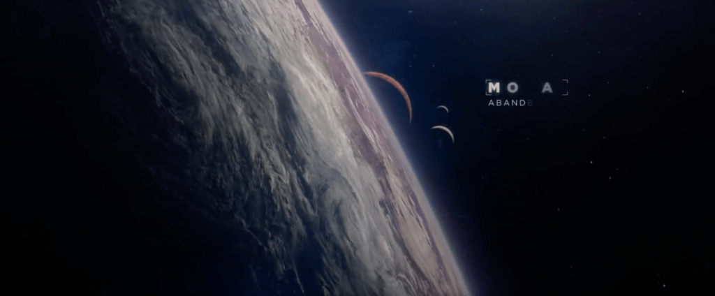
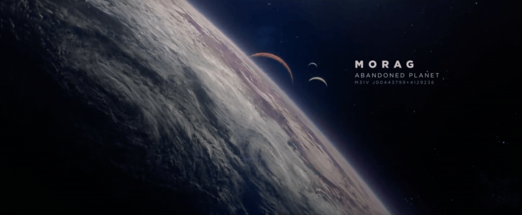
After researching some films with sci-fi title animations, I came across Guardians of the Galaxy and it’s title animation. Within the first 20 seconds of the opening scene in the video (https://youtu.be/JNlnQwHWSYw), the audience see a raging, stormy planet with extreme weather conditions – the title animation tells the audience that 26 years have passed from the very beginning of the film. The first screen grab shows the initial stage of the title animation and how it reveals itself to the audience – it has an coded like appearance when its denoted on the screen and each letter seems to be randomised with another letter from the alphabet. When it comes to decoding the letters, each one flickers through several letters until fully decoding to expose the correct one, which can be seen in the second screen grab.
After the first title animation (26 Years Later), the name of the planet is revealed in a similar way – from the first screen grab you can see that the letters are being decoded, however, this time there are multiple lines of information that are also be revealed too. I like the way in which its not all shown at once, it has a staggered effect which not only put emphasis onto the name of the planet but sub-consciously tells the audience what is the most and least important info being shown.
The main reason why I like it style of title animation is because of the coded like appearance when it appears on the screen – I feel that this suits the genre of the film really well and also adds to the science fiction element too. Secondly, I also really like the font thats used as it’s really well suited to the genre of the film – the serif font is very clear and easy to read. Additionally, it also looks very modern as sans serif fonts are more traditionally associated with classic/fancy texts. Thirdly, the hierarchy of the text is also very appealing as it clear and very well structured – the planet name is in bold and is the brightest at the top, this tells the audience that its the most important as it occupies most of the space. The description is second largest in the middle, this again tells the audience about its importance within the whole title and the co-ordinates are smallest and least visible at the bottom. Overall, this a very clear and aesthetically pleasing title animation comprising of several factors which help to communicate it information to the audience, so much so that it was continued on into the sequel, however, its used a different manner and I feel the overall effect of the title convention is less impacting on the audience when compared to the first (which can be seen below).
Overall, I would really like to use this convention within my own animation, however, I would like to adapt and develop upon it so that it more so suited to my theme. I feel like as the film and my animation both fit into the same general category of space that the title element would be very appropriate to use – I would have to think very clearly about the font and also the weight of the text, spacing and alignment as this would have a impact on the viewers experience when watching the animation either consciously or sub-consciously (they might be able to tell if the title element looks odd/out of place). In addition, I feel that the colour and power of the decoding element would have to be thought through clearly as this could also impact the audiences viewing experience.


