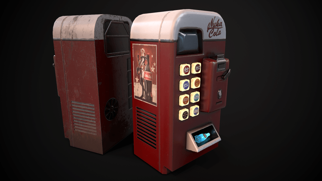
As I was experiencing some issues with my project, specifically the cube & x-particles colour palette, I have now decided to take a more commercial approach to the animation and make it brand orientated. The voice-over below discusses the issues in more depth:
My next step after this project update will be to experiment with different colour swatches for the displacement map image – this will allow me to potentially save a lot of time with resolving the current problem by changing the colour to a something that is more complementary to the scene, and not modelling something entirely different which will take many hours to make perfect.
However, if I am unable to find a more complementary range of colours for the cube, I will have to plan out the new vending machine model, which will focus on several different aspects of the design, including:
- Visual style
- Period/decade
- Colour palette
By planning these sections out it will enable me to create a model that not only matches the scene in terms of colour, but also as a whole making the animation look complete. I feel that I will want to create something that is slightly cartoony, with lots of illuminating aspects – I feel that this aesthetic of the vending machine will help match the abstract aesthetic of the animation, whilst also adding a fun/non-serious element to it.
Additionally, adding the vending machine will still reinforce the contrast between man-made and organic – an element that I have been want to incorporate from the beginning.
