For my project I will be researching different space aesthetics from different sources to help strengthen my idea, I will be further providing screen grabs and videos to help explain what I like about certain aspects within that source as well as an explanation as to how I intend to use it in my project.
Guardians of the Galaxy
Guardians of the Galaxy is an adventure sci-fi film that follows a group of intergalactic criminals who are force to work together. Within this film, the group travel around the universe to different planets which are introduced to the audience an very attractive way with slow cinematic shots. I would like to utilise the title/naming convention that is adhered to within the film, a specific example can be seen below where the brackets come up and reveal the name of the planet with extra features below it such as: a description and the planetary co-ordinates. (Full Intro: https://www.youtube.com/watch?v=JNlnQwHWSYw)
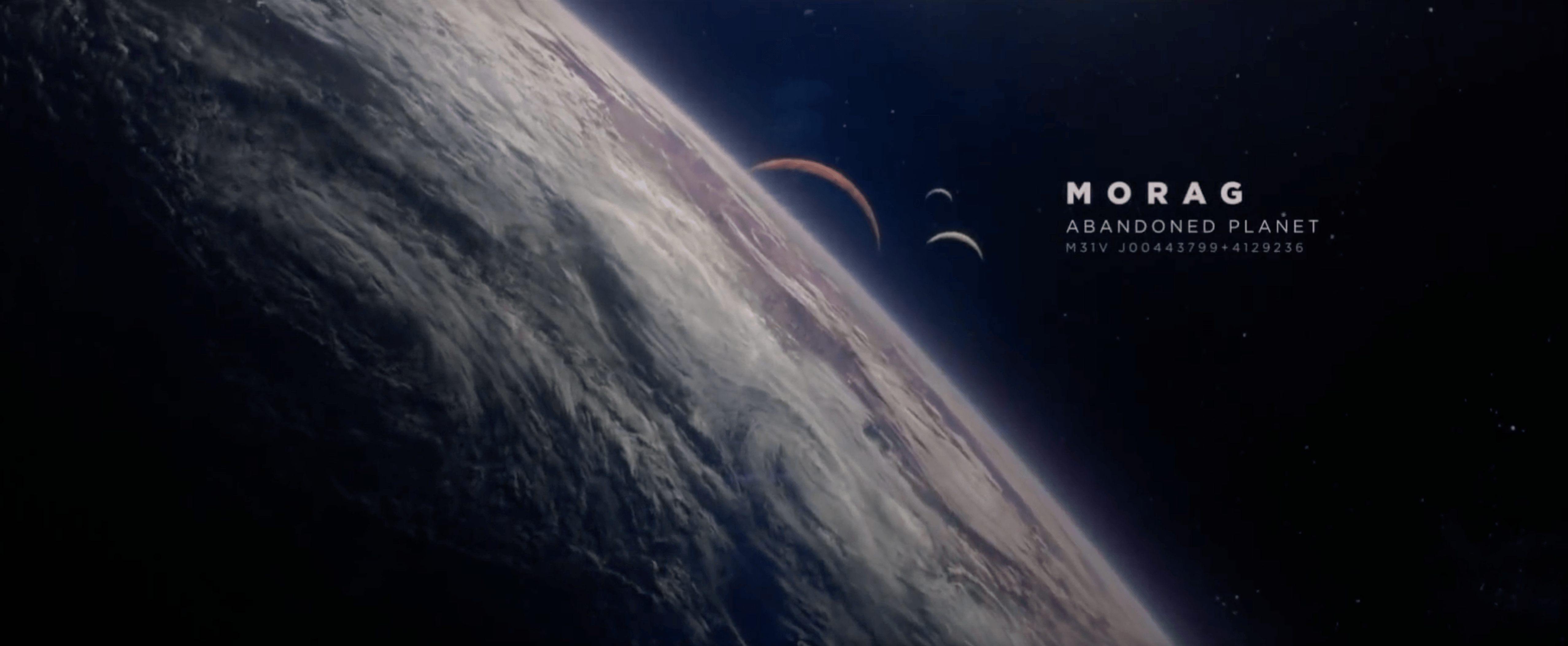
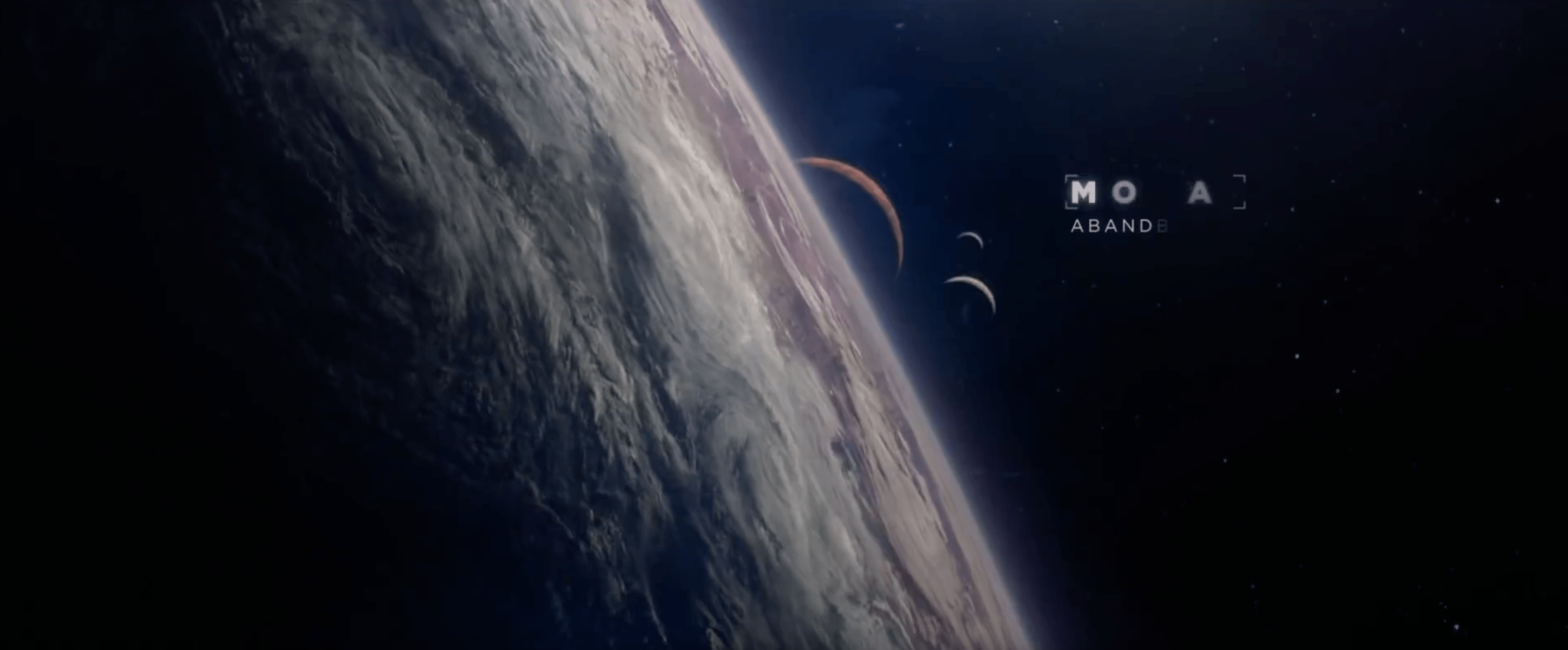
I feel that this convention would be highly adaptable and usable within my own project. I would intend to use this convention by showing to the viewers what the mysterious cube is in the space/zero-gravity environment. A small point would fade onto the cube to which a narrow arm from extend from it, this would then allow a point for the the cube name, description and co-ordinates to be displayed from.
In Addition, I would also like to try and replicate the space environment, through observation I can see that there are starts within the background, however, they aren’t overpowering and distracting. This would be an aesthetic I would also like to replicate within my project as I would want to keep the audiences attention on the objects in my scene.
Star Trek
Star Trek is another space themed adventure film, it follows the crew of a space who aim to defeat a villain with a specific fluid called ‘Red Matter’ which has the power to create blackholes and destroy the universe. Within a key scene at the end of the film, the container in which the red matter is kept gets mashed and the camera pans up to a group of small dots of the fluid, a quick series of edits inverts the images colours which adds a really dynamic effect – especially when accompanied by the non-diegetic sounds (can be seen below).
I would like to take this piece of inspiration and adapt in into my animation, I would like to use a similar camera shot (CU) to denote the spheres moving around, however, instead of inverting the image colours I would like to use an RGB spilt effect , cross cut with another perspective view of the spheres floating around the cube. I feel that this would made the animation more visually interesting to the views by showing them for information about the environment and if done correctly & subtly, it shouldn’t disorientate the audience.
Additionally, the ending of Star trek has a attractive space aesthetic which I feel inspires my work. Although I might not necessarily employ any of the convention used into my own animation, I feel that it narrows my aesthetic ideas more.
Ending Credits:
Overall, I really like the 3D effect that is created within the ending and I was fully surprised to find out it was created within Adobe After Effects by Andy Kramer. I didn’t associate After Effects as a powerful 3D software tool.
Oblivion
Oblivion is an adventure mystery about a veteran assigned to extract Earth’s remaining resources begins to question what he knows about his mission and himself. Within one of the final scene of the film, the hero find himself approaching a large space station called the ‘Tet’ that he didn’t know existed. The general object design of the tet is fairly simplistic, however, it again reflects the man-made aspect I want to incorporate within my own animation. The shot below as again shows the contrast between organic (Earth) and man made (the tet).
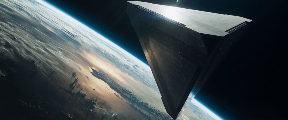
After the shot, the scene then cuts to the inside of the tet, which can be seen below:
The geometric design is reflected inside of the tet as well – I specifically like the use of straight lines as it further reinforces the notion of a man made structure – Within nature today, organic organisms adapt to their surroundings, twisting and turning around obstacles that might be in their way. The ‘Tet’ and also the cube in my animation are the binary opposites, the objects do the exact opposite and forces obstacles out of its way.
Star Wars
Star Wars, the very famous franchise, also incorporates elements which I desire to be inside of my animation. The geometric design on the death star is an obvious inspiration as it creates and interesting aesthetic. However, there are further elements about the design of the death star that jump out as well – I would also like to try to create luminance objects on the surface of the cube so that lights can be seen, this can be specifically seen in the large ridge across its perimeter, I feel that this adds a different aesthetic to the object – more functional than others such as the tet.
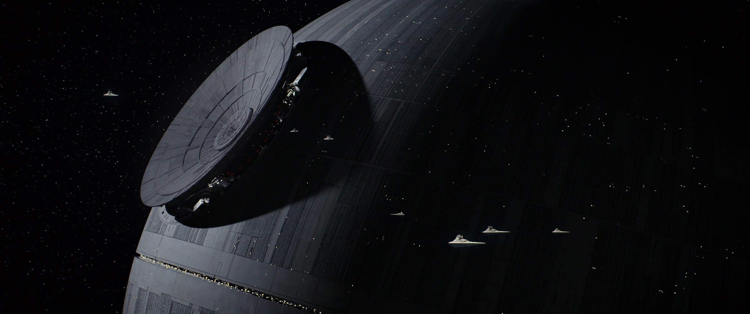
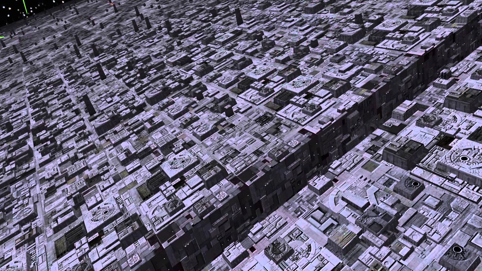
From the screen grab above, the death star further reinforces the geometric design I would like to have on the Cube in my animation – compared to the ‘Tet’ its geometric protrusions are more pronounced on the spheres surface which I feel makes it more interesting for the audience. In addition, the death star also conveys the notion of man made, something which I intend to use.
Leave a comment