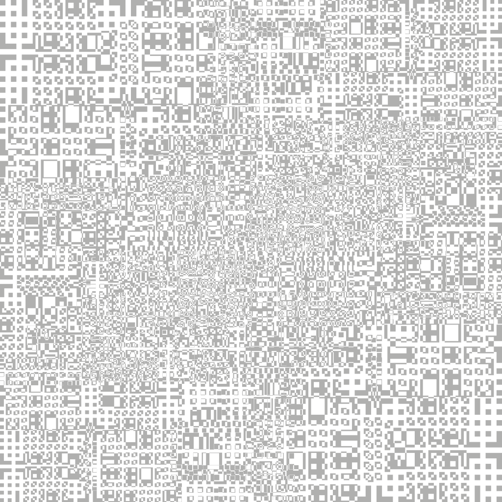
Continuing from part 1, I started to create another layer of the displacement map in Adobe illustrator to lay below the original one. The black and white sections within the image tell the software whether it should protrude from the object or whether it should depress (like binary, its either a 1 or a 0) – to further add another layer under the original will add more complexity to the image adding extra protrusions on top of the pre-exisiting ones from part 1, when this is added into C4D it will give the object more geometry as the protrusions will be sitting on raised sections, giving it more depth.
After completing the Illustrator section of this task, I transferred the image into After Effects to further add more complexity. Within the time-lapse you will see that I duplicated the original image many times – by doing this, I was able to shrink it down and place it in places of the image where I felt it was less populated by rectangles/squares. In addtion, I also added numerous curves effects to boost the dark and light values – the main reason for this is that it will make the depth variations more apparent when I take it into C4D.
Overall, I think my displacement map is looking more visually interesting from the last stage, it has lots of fine details which will hopefully create lots of small protrusions on the surface of the cube. However, I am a bit concerned that it might be too detailed – a lot of the shapes are very small which might be too small to see in the view port of C4D. When this is in the final project scene, I will be able to see for definite whether its too detailed or not – hopefully with the correct lighting I will be able to see all of the details within C4D. The next stage of this task is to test it out within C4D to see whether my map gives me the desired effect.


