Andy Kramer is a digital artist, most famous for his work on Star Trek’s ending credits. His work has a attractive space aesthetic which I feel inspires my work, I specifically like the way the scene is layered up especially with the planets – the way in which the asteroids seem to stand out against the planet and the dust is very attractive and is something I would like to incorporate into my own work. I could see myself using similar conventions when shallow focus’ are being used with the ring of spheres, this would help to add to the visual element of the animation as the audience would be able to get a better understand on the space or distance between the spheres and the cube. Additionally, I was fully surprised to find out that the ending of the film and the credits were created within Adobe After Effects – I didn’t associate After Effects as a powerful 3D software tool, but after some further research I discovered that Andy has developed some plug-in for AE that enable it to do so (and also with a bit of perspective trickery).
Tutorial Notes – Abstract Sphere
After completing my storyboard, I realised that I would need to find some interesting materials to texture my object with in my animation, this tutorial caught my eye because of how vibrant and interesting the textures were as well as the object itself. The tutorial was made by Patrick Foley:
Initial stage of the tutorial focused on the different render settings. Overall, the physical renderer was used and I learnt a lot about it that I never knew before – the physical renderer setting is a special renderer, including a physical camera that will be used in order to render photographic effects such as real 3D Depth of Field, Motion Blur, Vignetting, Chromatic Aberration etc. The benefits of using the physical renderer is that its faster than using the standard renderer when dealing with images with multiple, combined effect listed previously – this will be a good setting for myself to use within my project as some of the scene will have Depth of Field enabled, meaning that the physical renderer will render it out quicker when compared to the standard. Additionally, Ambient Occlusion and Global Illumination were selected too – Ambient Occlusion (AO) determines the degree to which each visible surface point is exposed and darkens it accordingly & Global Illumination (GI) is the interaction of light between different objects within a scene (reflects light of different materials to illuminate it).
Alongside of the render settings being set-up, a camera was also added to the scene and angled accordingly – when it was added, the co-ordinates were all zeroed out so that when the shape was added it was centred perfectly. Although this is something very simplistic, it was also something I had never through about doing before, when testing I had always added the camera and roughly placed it in the centre of the screen, this process an guarantee that the object will always be centred 100% of the time (Shortcut letter ‘O’).
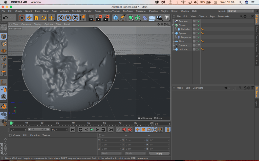
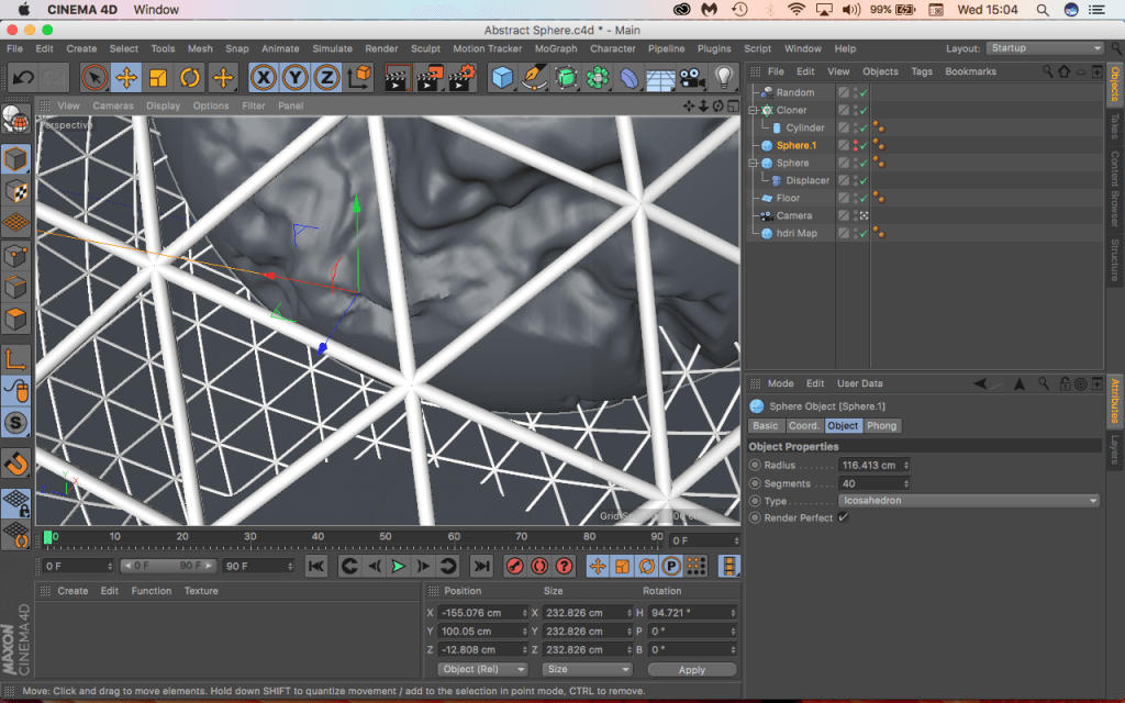
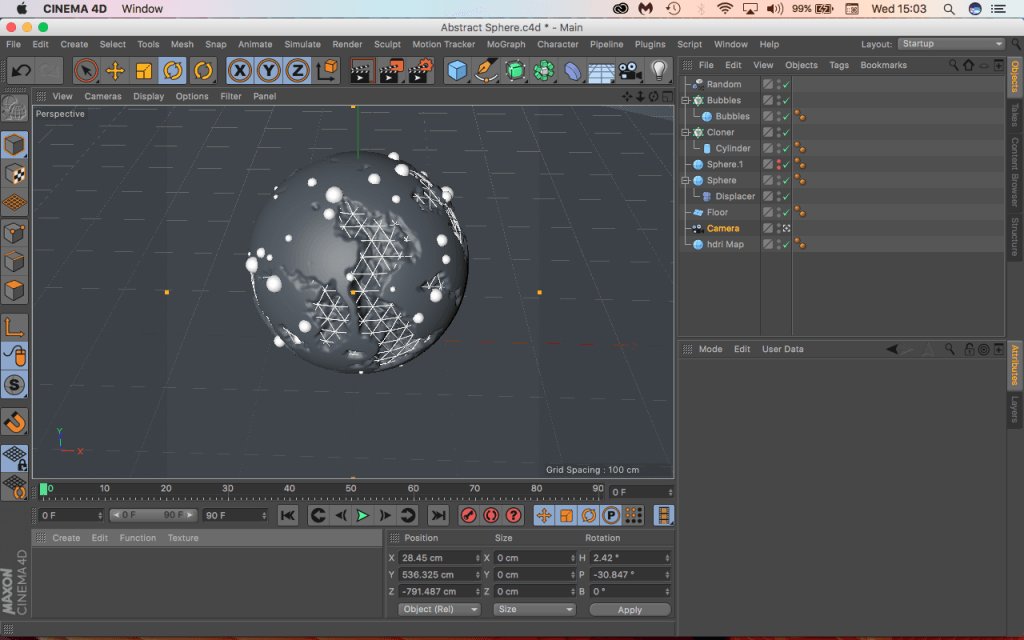
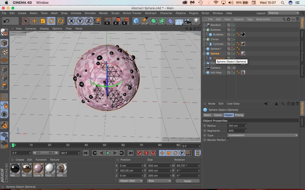
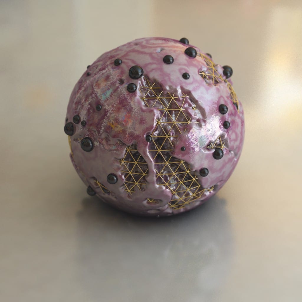
The second key part to the tutorial was the creation process of the objects. The main project consisted of 3 objects: A main sphere, An atom Array and Smaller surface spheres. It was interesting to see the how the objects were being layered up so that the atom array or the mesh was sitting inside of the larger sphere and also the smaller sphere were bing attached to the surface – I feel that the noise added to the larger sphere under Displacer > Shading > Shader > Noise made it more interesting and actually allowed for the atom array to look more organically integrated into the object. In addition, I didn’t know that I was able to add object to another objects surface under Object > Sphere & Up Vector > Surface within the cloner settings – this will be useful if I want to add any extra shapes to any object within my animation.
The last core part looked at the materials used to texturise the objects – the main sphere consisted of a really aesthetically pleasing marble effect that was made within the colour section of the material, I had full creative control over the colours as it gave me a gradient to select colour from as well as allowing me to control the strength of it too. The atom array consisted of a reflectance channel, that was coloured a faint yellow colour, as the underlaying properties of the object were very shiny, adding the yellow above made it appear to be gold in colour. And finally, the smaller surface sphere has very similar material characteristics to the larger sphere, just without the marbles and noise effect.
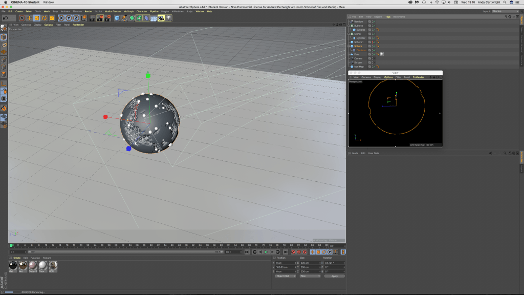
Another interesting piece of information that I found when following the tutorial was that Patrick used another display panel to view his project. I found this very useful when creating this tutorial as it was continuously rendering the scene allowing me to see what the object would look like with more detail and additionally, it also allowed me to fix the panel view to the camera – further meaning I could tweak it the editing panel and see a live preview of what the changes looked it. I feel that this would be extremely useful for my project, however, it is key to note that the performance of the instant rendering slowed down dramatically when textures were added, especially those that were reflective (like the gold mesh). The screen grab below shows how the primary large editing panel allowed me to make changes to the project while the smaller rendering panel gave me a live instant feedback.
The following screen grabs show my workflow within C4D and the renders are frames within my work:
Tutorial Notes – Glowing Sphere Animation
After storyboarding, I realised I wanted to use close-ups of spheres moving/vibrating organically. I found this tutorial which, although it has colour elements, utilises aesthetically pleasing movement of cloned spheres using rigid body tags in a confined space:
The initial stage of the tutorial focused on setting up the different sized spheres. Overall 3 different sizes spheres were created, the largest at 100cm, the middle at 30cm and the smallest at 15cm – this gave a good variation of different sized objects when put into a cloner. This produced a problem as they were all float through one another, so to change this a rigid body tag was applied, however, this made them explode when the play button was pressed. To overcome this, the ‘Follow Position’ setting under Force can be changed, which made the objects expand so that they weren’t floating inside of each other but also didn’t make them explode – this was a really useful piece of infomration as I didn’t know how to do this from my rigid body testing earlier.
The second key part involved the animation of the spheres that you can see in the animation – this was done with three random effectors: A Positional Effector, A Scale Effector and a Movement Scale Effector. The position effector dealt with the general movement of the objects, this was achieved under Effector > Random Mode > Noise. The scale effector dealt with the overall general increasing and decreasing in size of the spheres, this was achieved under Parameters > Scale (set to 0.6) > Uniform Scale (checked). And lastly, the movement scale had both of the effectors settings combined into one – this made the whole animation of the spheres more unpredictable and more or organic (compared to just increasing the other two effectors settings).
The third key part looked at the camera set-up and its positioning, this was a fairly easy and straight forward section within the tutorial as the output settings were HDTV (16:9) at 1920 x 1080p – these settings are very familiar to me as I alway export with these settings in After Effects CC and other Adobe softwares.
The last core part looked at the light shader (coloured band) that travelled through the objects to illuminate the spheres the different colours, this part I found the most useful and interesting because I have never dealt with something like it before. The light Shader consisted of a ‘Plain Effector’ under MoGraph > Effector that had a specific linear falloff radius in the Y+ axis so that when it passed through the group of spheres it barely showed through to the front side (which the camera was looking at), this cam be seen in some of the renders and screen grabs below. To really see the full effect of this, a material shader had to be created with only the luminance channel selected, under the luminance tab a mograph colour shade was checked (under Luminance > Texture > MoGraph > Colour Shader) and added to each of the different sized spheres in the cloner, this told the software that when the plain effector passed through, the luminance/colour of the object should be turned on.
The following renders are frames within my work and the video is the final animation:
Displacement Map – Part 3
Following from Part 2, I just created the displacement map within After Effects – I then opened up C4D on my computer and started to load in all the test objects for me to see whether my displacement map gave me the aesthetic I was looking for. I loaded up a ‘plane’ object in C4D, which is a horizontal flat square and applied the material to it, in which the displacement map had been loaded into the displacement tab inside it. I then experimented with the material settings to try and make it work as the tutorial used a plug-in which I didn’t have, making it useless, the video below shows my process:
As stated above, I encountered several problems within my process, the first one being the tutorial as it was using another plug-in called Octane – this is a similar products to Radeon’s ProRender which uses the graphics card or GPU to render the project instead of the CPU, this allows for the project to be constantly rendering in the display screen and also allows me to see what my project looks like in real time. These characteristics are very desirable to professionals within the industry as it reduces the amount of time it takes to create a project from start to finish, but it comes at a cost as physical components are worked very hard and at are more risk of failing. However, this didn’t stop me from testing the displacement map out in C4D, I got stuck when I first added the displacement map or material to the ‘plane’ object and couldn’t understand why it wasn’t working, after a while I found out that it was because of the number of segments in the object. The number of segments an object has defines how many pieces make it up, originally it was set to 10 but when I bumped it up to the maximum setting the map became more visible. I then followed the exact same steps but on the cube object, which produced the renders below:
Overall I think this is a really good piece of development for the project, however, I feel that there still needs to be some development of the displacement map in terms of the settings, specifically of the displacement strength as that renders produced aren’t up to the quality level I would like. The renders produced had a strength of 75% and also a height setting of 1% – I feel that it could do with a bit more height to make the protrusions more pronounced or maybe even a more simplistic map with less fine details, this would be more suited to the total number of segments available that the cube object can have as it would allow each protrusion to be cleaner and sharper. To progress from this point, I am going to research how to add colour to this displacement map with a colour palette that will be more suited to the overall theme of the animation – and then after this, I will test it by producing more renders.
Displacement Map – Part 2
Continuing from part 1, I started to create another layer of the displacement map in Adobe illustrator to lay below the original one. The black and white sections within the image tell the software whether it should protrude from the object or whether it should depress (like binary, its either a 1 or a 0) – to further add another layer under the original will add more complexity to the image adding extra protrusions on top of the pre-exisiting ones from part 1, when this is added into C4D it will give the object more geometry as the protrusions will be sitting on raised sections, giving it more depth.
After completing the Illustrator section of this task, I transferred the image into After Effects to further add more complexity. Within the time-lapse you will see that I duplicated the original image many times – by doing this, I was able to shrink it down and place it in places of the image where I felt it was less populated by rectangles/squares. In addtion, I also added numerous curves effects to boost the dark and light values – the main reason for this is that it will make the depth variations more apparent when I take it into C4D.
Overall, I think my displacement map is looking more visually interesting from the last stage, it has lots of fine details which will hopefully create lots of small protrusions on the surface of the cube. However, I am a bit concerned that it might be too detailed – a lot of the shapes are very small which might be too small to see in the view port of C4D. When this is in the final project scene, I will be able to see for definite whether its too detailed or not – hopefully with the correct lighting I will be able to see all of the details within C4D. The next stage of this task is to test it out within C4D to see whether my map gives me the desired effect.
