X-Particles Research

After creating a successful test of the displacement/height map, I decided to put that task on hold and try and conduct some research into X-Particles and try and find a way of creating a ring of spheres for my animation. After a generic search on YouTube, I can across this video by Greyscalegorilla that gave essential information on x-particles, which can be seen below:

The video mainly focusses on the Modifiers section within the X-particles plug-in, with trying to make the ring of spheres I though it would be a good video t watch as it might contain a lot of really useful information that I wouldn’t be able to understand in a quick time frame.

The first part of the video focussed on a particular modifier called xpNetwork which makes the particles that are emitted change direction at a specified angle at specified times/frames – for example, a particle would change 90º in any direct every 10 frames which creates a really geometric look. With the addition of  trails added to the particles, it creates a physical line behind it that tracks its path. Overall, this creates a really unique look that can be adjusted to your project needs – I could see this being used within a sci-fi film where a computer  generator created something within the real world but however, it doesn’t match my aesthetic that I want to achieve so I wont be using it.

The second part of the video focussed on xpSpeed which is a modifier that allows for better speed adjustment of the particles. Within the modifier, I would  be able to control the speed  by going into xpSystem > Modifiers > Motion Modifiers > Speed. It would then allow me to insert a value to tell the software to slow down or speed up the rate at which the particles are travelling – the larger the negative number would mean the faster it would slow down and vice versa which would enable me to achieve the aesthetic I would be looking for.

The last part of the video looks into xpTurbulance, this is very similar to the turbulence effector that is already on the stock version of C4D, however, its for the x-particles system. As its fairly similar, I wont go into details about it but It was a very effective way of making the particles react differently within the editor and could be something I might be able to use within my project.

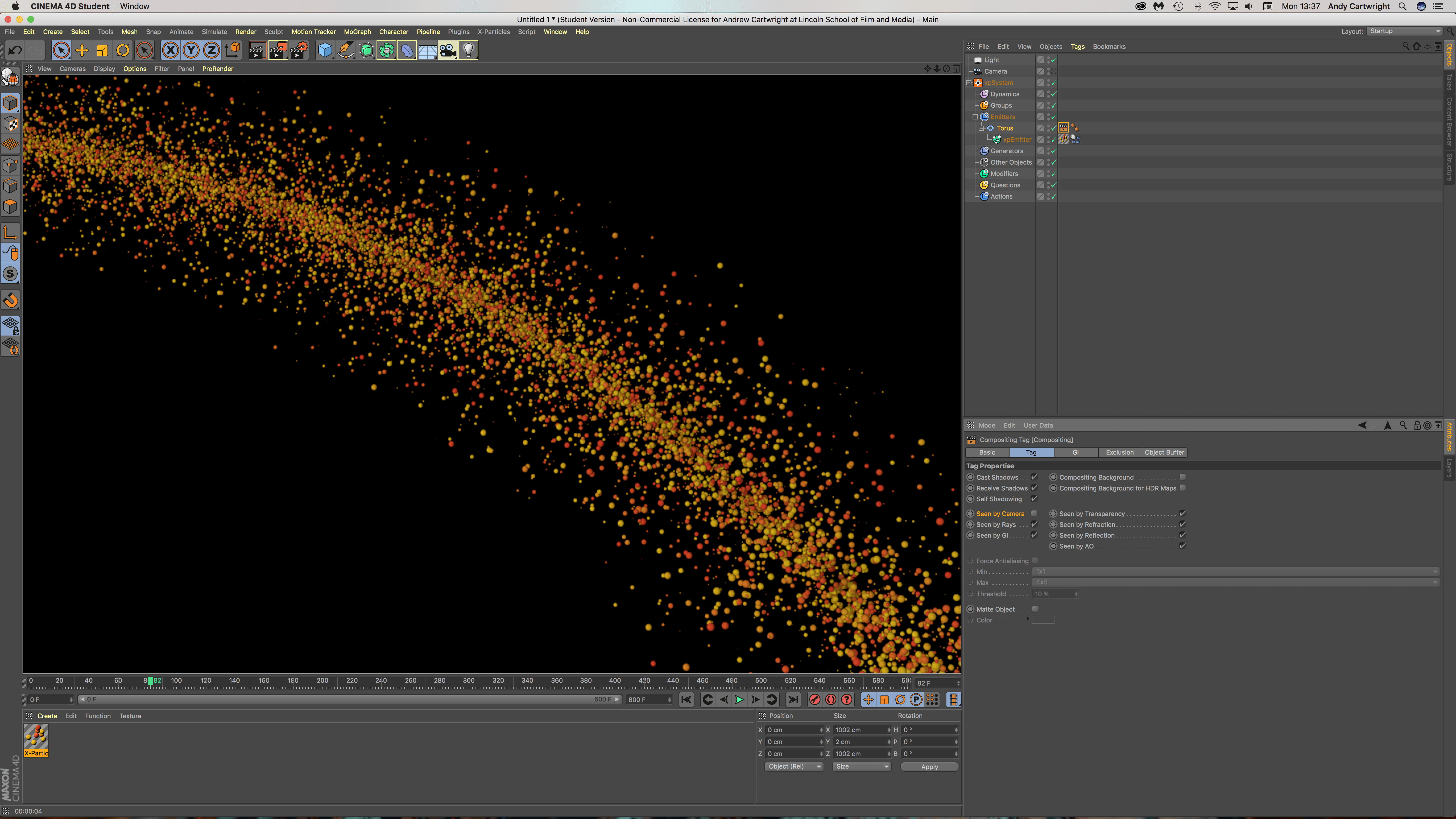
After watching that video, I decided to experiment in the software and dive in head first. The screen recording below shows my workflow and captured all of my different experimentation of trying to get the emitted particles to: A) be emitted in a torus shape (a ring), B) to make the emitted particles group together around the torus and C) rotate in a clockwise fashion.

For task A, I was able to make the torus become the emitting object for the particles, overall, this wasn’t a very complex task but as I didn’t know I spend a lot of time tweaking different settings as I though it was under another sub-heading in the Emission tab but I got there in the end. For task B, I wasn’t able to make the emitted objects group together, I tried adding a rigid body tag and experimenting  with the force as this worked within the Glowing Sphere Animation, but this didn’t work. Within the video embedded above, I might be able to control the speed in which the particles are emitted by going into xpSystem > Modifiers > Motion Modifiers > Speed. I would then have to insert a negative value to tell the software instead of speeding up as the timeline goes on, to slow down instead – the larger the negative number would mean the faster it would slow down and vice versa which would enable me to achieve the aesthetic I would be looking for. Lastly, for task C, I will have to experiment further with the rotational aspect of the project, I feel that I might have been able to make it do so by animating the emitter object (the torus) with key frames – At frame 0 I could have set a key frame so that by frame 90 it would have rotated 3 times for example. But to fully test this hypothesis, I will have to go back into the software and test it out.

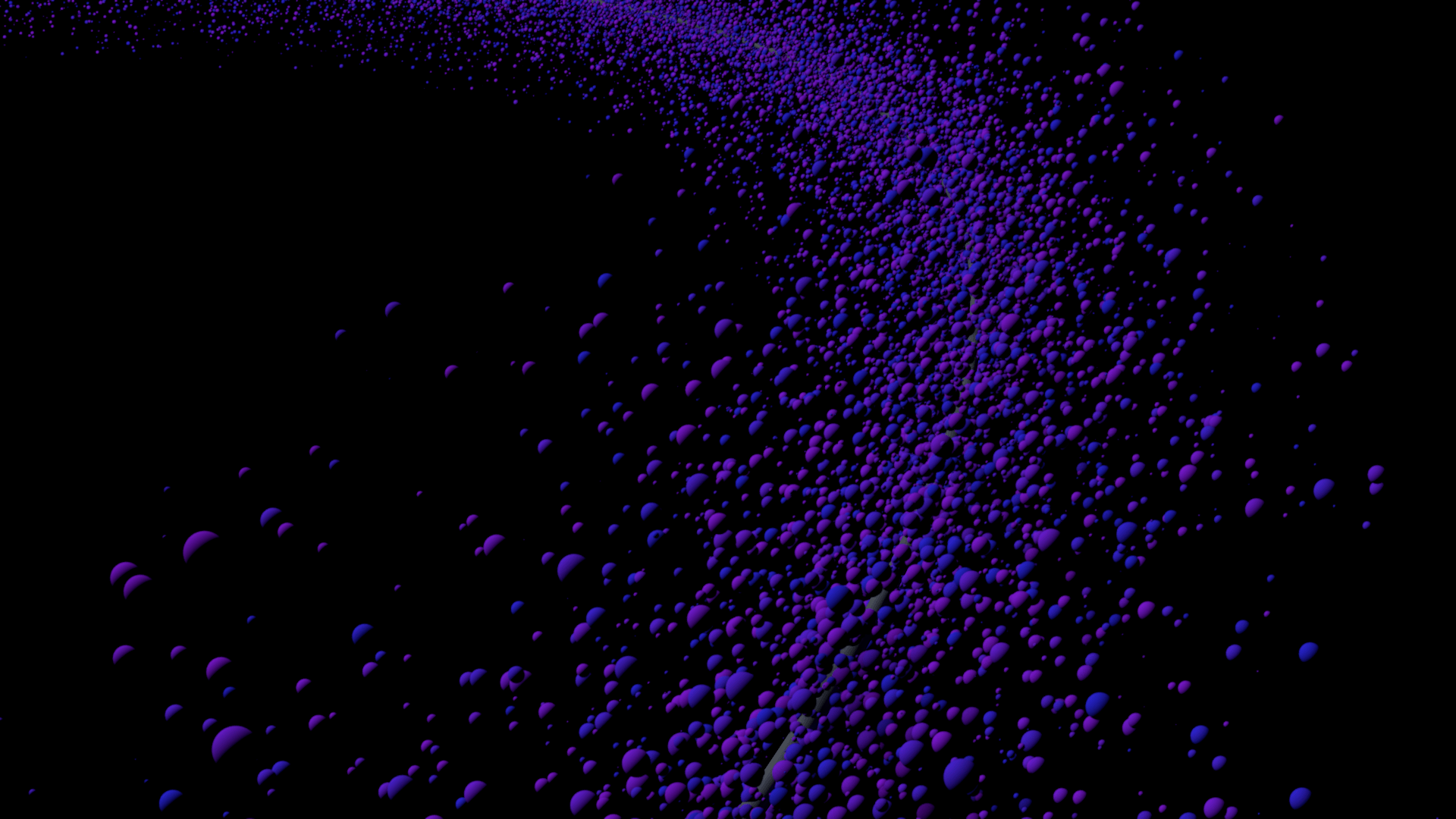
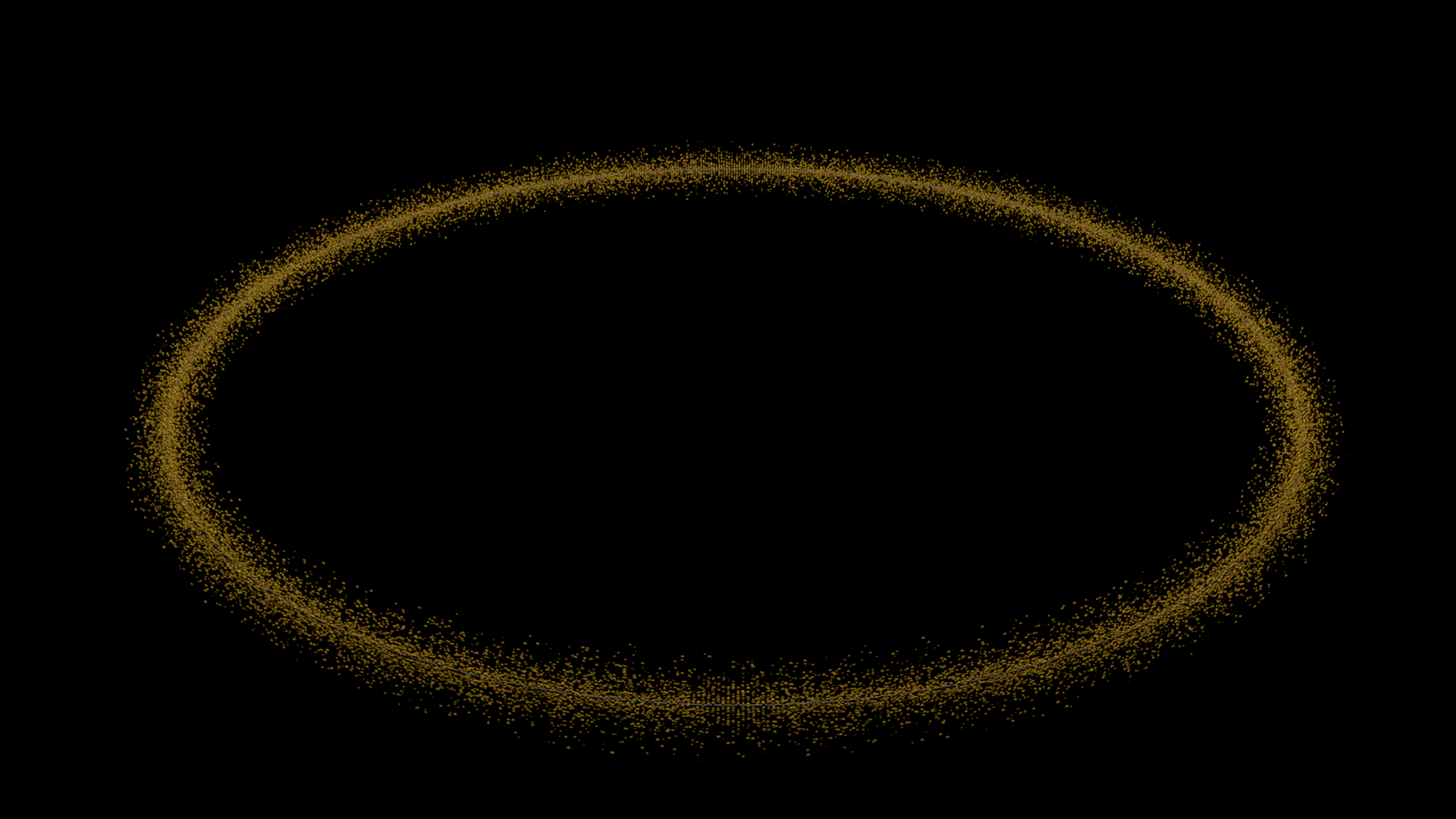
Here are some renders form that scene:

Screen Shot 2017-11-13 at 13.37.19 test2 X-Particles Test

Abstract Sphere – Animating

After following the abstract sphere tutorial on youtube, I was advised by my tutor to try and animate it as it was a still image – this at first seemed like a really daunting task as I had to consider so many more variables within this animation that I have never really dealt with. My first instinct was to make the sphere rotate as the whole object was really unique and I thought showing the whole back portion of the sphere might be interesting. Furthermore, it was suggested again by my tutor to try and make the small black spheres on the shape move or grow/shrink in size – as the original sphere was in a cloner I wasn’t able to make them move, however I was certain I could make the grow/shrink with key frames. This whole process was fairly easy, it involved the simple process of setting key frames, changing values slightly and then moving the timeline forward and repeating the process – at the beginning of the animation the sphere size was 0.6 and then I further increased it to 0.9 roughly every 15 frames, I didn’t want it to seem regular as the shape is fairly organic, I wanted the growing and shrinking process to be organic looking too. Additionally, I learnt something new by doing this process. Within the animation there is a short pan done by the camera, before I didn’t know how to doit but with the power of the Motion Camera Tag, I was able to set a start camera and a end camera and key frame the blending strength between them to create an aesthetically pleasing transition – this was good to know as I might be able to use this within my animation, however, I will more than likely just key frame the positional co-ordinates to make the camera move (which I didn’t think of doing at the time).

Overall, I feel like the process went well of turning the still image/project into a moving animation, however, I feel a number of factors could have been altered to improve it. Firstly, I feel that the ‘marble’ texture that was on the outer shell of the sphere could have been made less glossy, when the sphere rotated you are able to see the hdri map in the background very clearly – although this could be regarded as a good element about the project, I feel that it wasn’t very aesthetically pleasing in my personal preference. Additionally, I also should have made the black spheres on the outside grow & shrink more in size – I don’t feel that it was very noticeable so having them grow larger might have resolved it – as well, even having the sphere’s grow/shrink at a faster rate might have had a better effect too.

Abstract SphereFinal


Tutorial Notes – Glowing Sphere Animation

After storyboarding, I realised I wanted to use close-ups of spheres moving/vibrating organically. I found this tutorial which, although it has colour elements, utilises aesthetically pleasing movement of cloned spheres using rigid body tags in a confined space:

The initial stage of the tutorial focused on setting up the different sized spheres. Overall 3 different sizes spheres were created, the largest at 100cm, the middle at 30cm and the smallest at 15cm – this gave a good variation of different sized objects when put into a cloner. This produced a problem as they were all float through one another, so to change this a rigid body tag was applied, however, this made them explode when the play button was pressed. To overcome this, the ‘Follow Position’ setting under Force can be changed, which made the objects expand so that they weren’t floating inside of each other but also didn’t make them explode – this was a really useful piece of infomration as I didn’t know how to do this from my rigid body testing earlier.

The second key part involved the animation of the spheres that you can see in the animation – this was done with three random effectors: A Positional Effector, A Scale Effector and a Movement Scale Effector. The position effector dealt with the general movement of the objects, this was achieved under Effector > Random Mode > Noise. The scale effector dealt with the overall general increasing and decreasing in size of the spheres, this was achieved under Parameters > Scale (set to 0.6) > Uniform Scale (checked). And lastly, the movement scale had both of the effectors settings combined into one – this made the whole animation of the spheres more unpredictable and more or organic (compared to just increasing the other two effectors settings).

The third key part looked at the camera set-up and its positioning, this was a fairly easy and straight forward section within the tutorial as the output settings were HDTV (16:9) at 1920 x 1080p – these settings are very familiar to me as I alway export with these settings in After Effects CC and other Adobe softwares.

The last core part looked at the light shader (coloured band) that travelled through the objects to illuminate the spheres the different colours, this part I found the most useful and interesting because I have never dealt with something like it before. The light Shader consisted of a ‘Plain Effector’ under MoGraph > Effector that had a specific linear falloff radius in the Y+ axis so that when it passed through the group of spheres it barely showed through to the front side (which the camera was looking at), this cam be seen in some of the renders and screen grabs below. To really see the full effect of this, a material shader had to be created with only the luminance channel selected, under the luminance tab a mograph colour shade was checked (under Luminance > Texture > MoGraph > Colour Shader) and added to each of the different sized spheres in the cloner, this told the software that when the plain effector passed through, the luminance/colour of the object should be turned on.

The following renders are frames within my work and the video is the final animation:

Screen Shot 2017-11-08 at 10.36.38

Screen Shot 2017-11-08 at 10.36.13

Screen Shot 2017-11-08 at 10.35.26

Screen Shot 2017-11-08 at 10.37.46

Screen Shot 2017-11-08 at 10.38.26


Shiny Balls

Shiny Balls2

Displacement Map – Part 3

Following from Part 2, I just created the displacement map within After Effects – I then opened up C4D on my computer and started to load in all the test objects for me to see whether my displacement map gave me the aesthetic I was looking for. I loaded up a ‘plane’ object in C4D, which is a horizontal flat square and applied the material to it, in which the displacement map had been loaded into the displacement tab inside it. I then experimented with the material settings to try and make it work as the tutorial used a plug-in which I didn’t have, making it useless, the video below shows my process:

As stated above, I encountered several problems within my process, the first one being the tutorial as it was using another plug-in called Octane – this is a similar products to Radeon’s ProRender which uses the graphics card or GPU to render the project instead of the CPU, this allows for the project to be constantly rendering in the display screen and also allows me to see what my project looks like in real time. These characteristics are very desirable to professionals within the industry as it reduces the amount of time it takes to create a project from start to finish, but it comes at a cost as physical components are worked very hard and at are more risk of failing. However, this didn’t stop me from testing the displacement map out in C4D, I got stuck when I first added the displacement map or material to the ‘plane’ object and couldn’t understand why it wasn’t working, after a while I found out that it was because of the number of segments in the object. The number of segments an object has defines how many pieces make it up, originally it was set to 10 but when I bumped it up to the maximum setting the map became more visible. I then followed the exact same steps but on the cube object, which produced the renders below:

displacementtest2

Displacetest

DMT3

Overall I think this is a really good piece of development for the project, however, I feel that there still needs to be some development of the displacement map in terms of the settings, specifically of the displacement strength as that renders produced aren’t up to the quality level I would like. The renders produced had a strength of 75% and also a height setting of 1% – I feel that it could do with a bit more height to make the protrusions more pronounced or maybe even a more simplistic map with less fine details, this would be more suited to the total number of segments available that the cube object can have as it would allow each protrusion to be cleaner and sharper. To progress from this point, I am going to research how to add colour to this displacement map with a colour palette that will be more suited to the overall theme of the animation – and then after this, I will test it by producing more renders.

Displacement Map – Part 2

Continuing from part 1, I started to create another layer of the displacement map in Adobe illustrator to lay below the original one. The black and white sections within the image tell the software whether it should protrude from the object or whether it should depress (like binary, its either a 1 or a 0) – to further add another layer under the original will add more complexity to the image adding extra protrusions on top of the pre-exisiting ones from part 1, when this is added into C4D it will give the object more geometry as the protrusions will be sitting on raised sections, giving it more depth.

Displacementmap

After completing the Illustrator section of this task, I transferred the image into After Effects to further add more complexity. Within the time-lapse you will see that I duplicated the original image many times – by doing this, I was able to shrink it down and place it in places of the image where I felt it was less populated by rectangles/squares. In addtion, I also added numerous curves effects to boost the dark and light values – the main reason for this is that it will make the depth variations more apparent when I take it into C4D.

DisplacementMap_1_00000

Overall, I think my displacement map is looking more visually interesting from the last stage, it has lots of fine details which will hopefully create lots of small protrusions on the surface of the cube. However, I am a bit concerned that it might be too detailed –  a lot of the shapes are very small which might be too small to see in the view port of C4D. When this is in the final project scene, I will be able to see for definite whether its too detailed or not – hopefully with the correct lighting I will be able to see all of the details within C4D. The next stage of this task is to test it out within C4D to see whether my map gives me the desired effect.