Displacement Map – Part 1

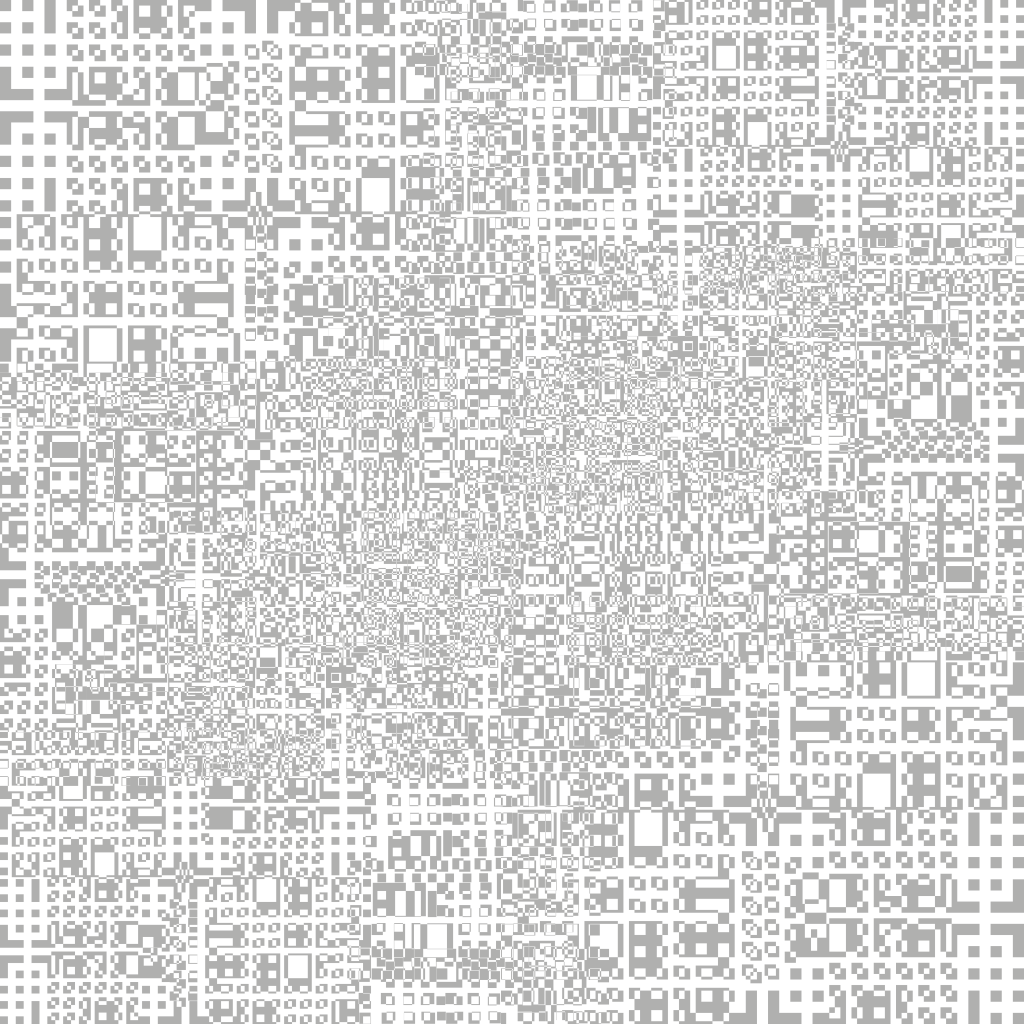
When explaining my project before, I have mentioned that I wanted to create a main central object – A geometric cube floating in space. To create this cube, I am going to utilise displacement mapping techniques within C4D to create square/rectangular protrusions or depressions which will help me achieve that geometric or industrial style that I desire. I have found a YouTube tutorial on this technique and its actual intended purpose is to make something similar as what I want to make, which is also very beneficial.

Following this tutorial, I started to create my own displacement map creating different sized rectangles and squares, overlapping them and then excluding them from each other – it is this element within the whole project which will really help to bring the displacement map alive. I feel that one aspect that I should be aware of is to not make the map too detailed as that will not only increase my rendering times dramatically but it also might not be visible from a distance. Below I have created a time-lapse of my creative process and I have also provided of the map.

Displacementmap2

Overall, I think my displacement map looks good, it has lots of fine details which will hopefully create lots of small protrusions on the surface of the cube. When this is in the final project scene, I hope that with the correct lighting I will be able to camera all of the little details and make it look really interesting to the audience. The next stage of this task is to create a secondary map that will be layered on top of it to add even more variation and to also test it out within C4D to see whether my map gives me the desired effect.
Rigid Body Testing – Success & Failure

Success:

Within my animation/C4D I will be heavily using rigid body tags and physics to make my spheres or the ring of spheres seem more realistic – A rigid body tag allows for object within the software to have a hard physical surface, so that when it contacts another object with similar properties, they collide and bounce off each other. I have experimented with this tag inside of C4D to produce the video below, it shows a red cube falling and landing on an uneven landscape. I was really surprised to see how well the cube reacted within the software as it already looked realistic without having to change any of the settings – however, it was key to note that this was a 3 second animation (90 Frames) and took over 4 hours to render on a high quality setting with Ambient Occlusion & Global Illumination enabled, I will have to leave enough time before the deadline to allow everything to be rendered.

Failure:

To further push my skills with the rigid body physics, I tried to apply the same techniques but on a sphere instead so that when it collided with another sphere for example, they bounced off each other and reacted in a realist manner. However, my attempt at this failed – I was unable to get the spheres to react in the way I wanted, I put one sphere into a cloner and then into a random effector to produce a large cluster of different sizes objects. I then further put a rigid body tag on the original object, expecting the touching spheres to be pushed apart but they had a more dramatic effect of exploding – from this point onwards I was unable to get the touching spheres to separate without exploding violently, this will have to be another area to research not only in C4D but also in X-Particles as this will be the system I will use to make the ring of spheres for my animation.

Motion Graphic Testing

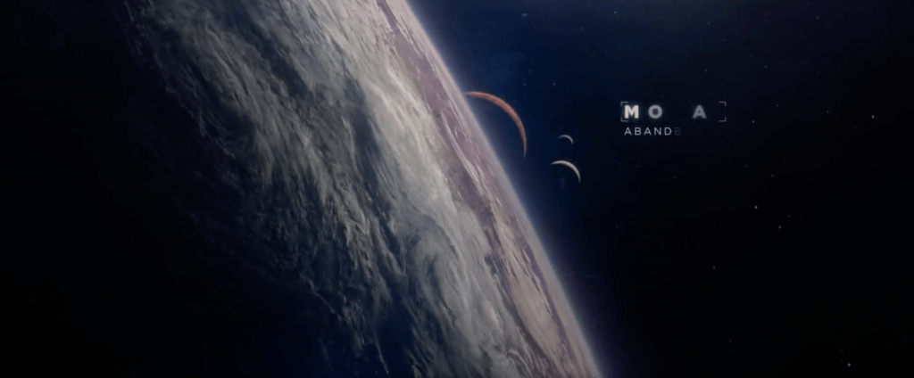
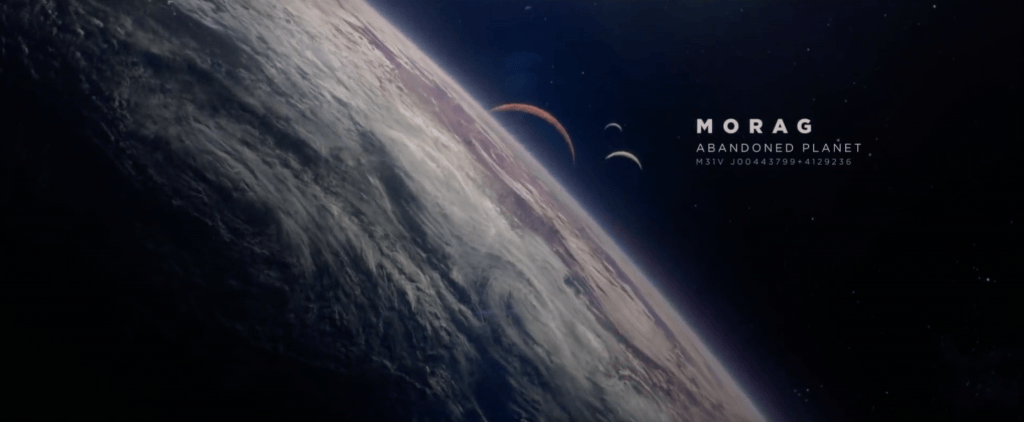
Within my scene, whenever the audience first see’s the geometric cube I want a bit of motion graphics work to ‘grow’ from the cube and reveal the name of the object. This is most notably done in Guardians of the Galaxy where the main characters travel to a new planet, the decoder effect is then used to reveal the planet name to the audience as well as giving conventional planetary co-ordinates to further denote the space/travelling theme. To replicate this, I have found a text effect within Adobe After Effects called ‘Decoder’ which randomises each letter of the desired text, and within a specific timeframe it flickers through a select number of letters to reveal the correct one (and this is done one letter at a time, creating a really pleasing effect).

The video above is the final iteration of the test and clearly demonstrates the aesthetic I’m trying to go for – this will be of a much higher quality when it comes to final piece and will be coloured accordingly, however, the main objective of this was to see if I could do it. Again, when it comes tot he final piece I aim to use the motion tracker inside of After Effects to make the graphic ‘stick’ to the geometric cube – further giving it a higher quality level.

Titles Inspiration

After researching some films with sci-fi title animations, I came across Guardians of the Galaxy and it’s title animation. Within the first 20 seconds of the opening scene in the video (https://youtu.be/JNlnQwHWSYw), the audience see a raging, stormy planet with extreme weather conditions – the title animation tells the audience that 26 years have passed from the very beginning of the film. The first screen grab shows the initial stage of the title animation and how it reveals itself to the audience – it has an coded like appearance when its denoted on the screen and each letter seems to be randomised with another letter from the alphabet. When it comes to decoding the letters, each one flickers through several letters until fully decoding to expose the correct one, which can be seen in the second screen grab.

Screen Shot 2017-11-05 at 20.44.51 Screen Shot 2017-11-05 at 20.45.03

After the first title animation (26 Years Later), the name of the planet is revealed in a similar way – from the first screen grab you can see that the letters are being decoded, however, this time there are multiple lines of information that are also be revealed too. I like the way in which its not all shown at once, it has a staggered effect which not only put emphasis onto the name of the planet but sub-consciously tells the audience what is the most and least important info being shown.

Screen Shot 2017-11-05 at 20.45.13 Screen Shot 2017-11-05 at 20.45.22

The main reason why I like it style of title animation is because of the coded like appearance when it appears on the screen – I feel that this suits the genre of the film really well and also adds to the science fiction element too. Secondly, I also really like the font thats used as it’s really well suited to the genre of the film –  the serif font is very clear and easy to read. Additionally, it also looks very modern as sans serif fonts are more traditionally associated with classic/fancy texts. Thirdly, the hierarchy of the text is also very appealing as it clear and very well structured – the planet name is in bold and is the brightest at the top, this tells the audience that its the most important as it occupies most of the space. The description is second largest in the middle, this again tells the audience about its importance within the whole title and the co-ordinates are smallest and least visible at the bottom. Overall, this a very clear and aesthetically pleasing title animation comprising of several factors which help to communicate it information to the audience, so much so that it was continued on into the sequel, however, its used a different manner and I feel the overall effect of the title convention is less impacting on the audience when compared to the first (which can be seen below).

Overall, I would really like to use this convention within my own animation, however, I would like to adapt and develop upon it so that it more so suited to my theme. I feel like as the film and my animation both fit into the same general category of space that the title element would be very appropriate to use – I would have to think very clearly about the font and also the weight of the text, spacing and alignment as this would have a impact on the viewers experience when watching the animation either consciously or sub-consciously (they might be able to tell if the title element looks odd/out of place). In addition, I feel that the colour and power of the decoding element would have to be thought through clearly as this could also impact the audiences viewing experience.

Basic TV Staging (1974)

9780240508528-us

Another book by G, Millerson Basic TV Staging will help explain key concepts about composition within a shot, this will allow me to stage mine so that there is balance within each so that it looks more aesthetically pleasing.

Within the book I will be specifically looking at Chapters:

  • Purpose of Staging (Page 10)
  • Staging Styles (Page 16)
  • Staging Opportunities (Page 18)
  • Neutral Backgrounds (page 112)

Purpose of Staging

Staging or setting the scene within a animation or video aims to create a particular pictorial effect, this then creates a reality which was never real in the first place – it was materialised, for example having a star field background in an animation aims to immerse the views into believing that it took place in space, when in reality it was created digitally. So generally, it can be stated that staging provides the background for the performance of the project, and this background can consist of the plainest materials or really complex ones – it still has the same general effect. However, it is key to note that having the wrong background for the performance may dominate it – this would take the viewers attention from the performance which isn’t beneficial.

Staging Styles

When it comes to staging my animation, I will have to think clearly as the background should match both the programme material and presentation approach – It wouldn’t be very effective having a bright pink background when the whole animation is supposed to take place within a space/zero gravity environment. I will try and replicate a realistic environment, in this case space – i will create a ‘star field’ material inside of C4D where you can see glowing stars when rendering, this will help reinforce the notion that it is in a space setting, however, I will have to play with the settings to make sure that the background/stars aren’t too dominant to distract the viewer.

Staging Opportunities

A major factor when considering the opportunities of staging are the physical parameters of the objects, as the scene will be consisting of a cube with a ring of sphere’s around it, I will have to factor in its size – if the background is too narrow then it will appear that some of the spheres will be cut in half which will be an undesired aesthetic. Additionally, the staging also needs to conform to established concepts or notions that people already have about space – this is an opportunity to further boost the realism in the animation as observant viewers will realise thats what its trying to replicate.

Neutral Backgrounds

If I am unable to get the ‘star field’ material to work in my animation, I will be using neutral background – again as its a space themed animation, I will use a black background which connotes notions of: Night, Mystery, Heaviness, Sombreness and Smartness – to which I intend to try an incorporate the element of mystery, especially with the use of the geometric cube. A benefit of having a neutral background is that I can have a wide range of flexibility with the camera settings, notably with the depth of field – having a shallow depth of field blurs the background of any scene, having a plain neutral colour allows for wider extremes to push the camera too as there re no significant details in the background that are lost.