Tutorial Notes – Glowing Sphere Animation

After storyboarding, I realised I wanted to use close-ups of spheres moving/vibrating organically. I found this tutorial which, although it has colour elements, utilises aesthetically pleasing movement of cloned spheres using rigid body tags in a confined space:

The initial stage of the tutorial focused on setting up the different sized spheres. Overall 3 different sizes spheres were created, the largest at 100cm, the middle at 30cm and the smallest at 15cm – this gave a good variation of different sized objects when put into a cloner. This produced a problem as they were all float through one another, so to change this a rigid body tag was applied, however, this made them explode when the play button was pressed. To overcome this, the ‘Follow Position’ setting under Force can be changed, which made the objects expand so that they weren’t floating inside of each other but also didn’t make them explode – this was a really useful piece of infomration as I didn’t know how to do this from my rigid body testing earlier.

The second key part involved the animation of the spheres that you can see in the animation – this was done with three random effectors: A Positional Effector, A Scale Effector and a Movement Scale Effector. The position effector dealt with the general movement of the objects, this was achieved under Effector > Random Mode > Noise. The scale effector dealt with the overall general increasing and decreasing in size of the spheres, this was achieved under Parameters > Scale (set to 0.6) > Uniform Scale (checked). And lastly, the movement scale had both of the effectors settings combined into one – this made the whole animation of the spheres more unpredictable and more or organic (compared to just increasing the other two effectors settings).

The third key part looked at the camera set-up and its positioning, this was a fairly easy and straight forward section within the tutorial as the output settings were HDTV (16:9) at 1920 x 1080p – these settings are very familiar to me as I alway export with these settings in After Effects CC and other Adobe softwares.

The last core part looked at the light shader (coloured band) that travelled through the objects to illuminate the spheres the different colours, this part I found the most useful and interesting because I have never dealt with something like it before. The light Shader consisted of a ‘Plain Effector’ under MoGraph > Effector that had a specific linear falloff radius in the Y+ axis so that when it passed through the group of spheres it barely showed through to the front side (which the camera was looking at), this cam be seen in some of the renders and screen grabs below. To really see the full effect of this, a material shader had to be created with only the luminance channel selected, under the luminance tab a mograph colour shade was checked (under Luminance > Texture > MoGraph > Colour Shader) and added to each of the different sized spheres in the cloner, this told the software that when the plain effector passed through, the luminance/colour of the object should be turned on.

The following renders are frames within my work and the video is the final animation:

Screen Shot 2017-11-08 at 10.36.38

Screen Shot 2017-11-08 at 10.36.13

Screen Shot 2017-11-08 at 10.35.26

Screen Shot 2017-11-08 at 10.37.46

Screen Shot 2017-11-08 at 10.38.26


Shiny Balls

Shiny Balls2

Displacement Map – Part 3

Following from Part 2, I just created the displacement map within After Effects – I then opened up C4D on my computer and started to load in all the test objects for me to see whether my displacement map gave me the aesthetic I was looking for. I loaded up a ‘plane’ object in C4D, which is a horizontal flat square and applied the material to it, in which the displacement map had been loaded into the displacement tab inside it. I then experimented with the material settings to try and make it work as the tutorial used a plug-in which I didn’t have, making it useless, the video below shows my process:

As stated above, I encountered several problems within my process, the first one being the tutorial as it was using another plug-in called Octane – this is a similar products to Radeon’s ProRender which uses the graphics card or GPU to render the project instead of the CPU, this allows for the project to be constantly rendering in the display screen and also allows me to see what my project looks like in real time. These characteristics are very desirable to professionals within the industry as it reduces the amount of time it takes to create a project from start to finish, but it comes at a cost as physical components are worked very hard and at are more risk of failing. However, this didn’t stop me from testing the displacement map out in C4D, I got stuck when I first added the displacement map or material to the ‘plane’ object and couldn’t understand why it wasn’t working, after a while I found out that it was because of the number of segments in the object. The number of segments an object has defines how many pieces make it up, originally it was set to 10 but when I bumped it up to the maximum setting the map became more visible. I then followed the exact same steps but on the cube object, which produced the renders below:

displacementtest2

Displacetest

DMT3

Overall I think this is a really good piece of development for the project, however, I feel that there still needs to be some development of the displacement map in terms of the settings, specifically of the displacement strength as that renders produced aren’t up to the quality level I would like. The renders produced had a strength of 75% and also a height setting of 1% – I feel that it could do with a bit more height to make the protrusions more pronounced or maybe even a more simplistic map with less fine details, this would be more suited to the total number of segments available that the cube object can have as it would allow each protrusion to be cleaner and sharper. To progress from this point, I am going to research how to add colour to this displacement map with a colour palette that will be more suited to the overall theme of the animation – and then after this, I will test it by producing more renders.

Displacement Map – Part 2

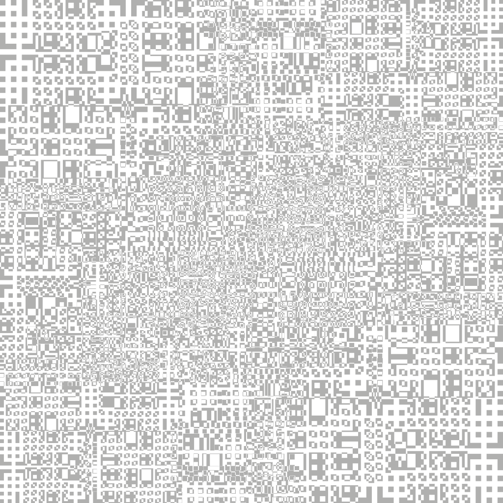
Continuing from part 1, I started to create another layer of the displacement map in Adobe illustrator to lay below the original one. The black and white sections within the image tell the software whether it should protrude from the object or whether it should depress (like binary, its either a 1 or a 0) – to further add another layer under the original will add more complexity to the image adding extra protrusions on top of the pre-exisiting ones from part 1, when this is added into C4D it will give the object more geometry as the protrusions will be sitting on raised sections, giving it more depth.

Displacementmap

After completing the Illustrator section of this task, I transferred the image into After Effects to further add more complexity. Within the time-lapse you will see that I duplicated the original image many times – by doing this, I was able to shrink it down and place it in places of the image where I felt it was less populated by rectangles/squares. In addtion, I also added numerous curves effects to boost the dark and light values – the main reason for this is that it will make the depth variations more apparent when I take it into C4D.

DisplacementMap_1_00000

Overall, I think my displacement map is looking more visually interesting from the last stage, it has lots of fine details which will hopefully create lots of small protrusions on the surface of the cube. However, I am a bit concerned that it might be too detailed –  a lot of the shapes are very small which might be too small to see in the view port of C4D. When this is in the final project scene, I will be able to see for definite whether its too detailed or not – hopefully with the correct lighting I will be able to see all of the details within C4D. The next stage of this task is to test it out within C4D to see whether my map gives me the desired effect.

Displacement Map – Part 1

When explaining my project before, I have mentioned that I wanted to create a main central object – A geometric cube floating in space. To create this cube, I am going to utilise displacement mapping techniques within C4D to create square/rectangular protrusions or depressions which will help me achieve that geometric or industrial style that I desire. I have found a YouTube tutorial on this technique and its actual intended purpose is to make something similar as what I want to make, which is also very beneficial.

Following this tutorial, I started to create my own displacement map creating different sized rectangles and squares, overlapping them and then excluding them from each other – it is this element within the whole project which will really help to bring the displacement map alive. I feel that one aspect that I should be aware of is to not make the map too detailed as that will not only increase my rendering times dramatically but it also might not be visible from a distance. Below I have created a time-lapse of my creative process and I have also provided of the map.

Displacementmap2

Overall, I think my displacement map looks good, it has lots of fine details which will hopefully create lots of small protrusions on the surface of the cube. When this is in the final project scene, I hope that with the correct lighting I will be able to camera all of the little details and make it look really interesting to the audience. The next stage of this task is to create a secondary map that will be layered on top of it to add even more variation and to also test it out within C4D to see whether my map gives me the desired effect.

Titles Inspiration

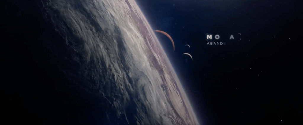
After researching some films with sci-fi title animations, I came across Guardians of the Galaxy and it’s title animation. Within the first 20 seconds of the opening scene in the video (https://youtu.be/JNlnQwHWSYw), the audience see a raging, stormy planet with extreme weather conditions – the title animation tells the audience that 26 years have passed from the very beginning of the film. The first screen grab shows the initial stage of the title animation and how it reveals itself to the audience – it has an coded like appearance when its denoted on the screen and each letter seems to be randomised with another letter from the alphabet. When it comes to decoding the letters, each one flickers through several letters until fully decoding to expose the correct one, which can be seen in the second screen grab.

Screen Shot 2017-11-05 at 20.44.51 Screen Shot 2017-11-05 at 20.45.03

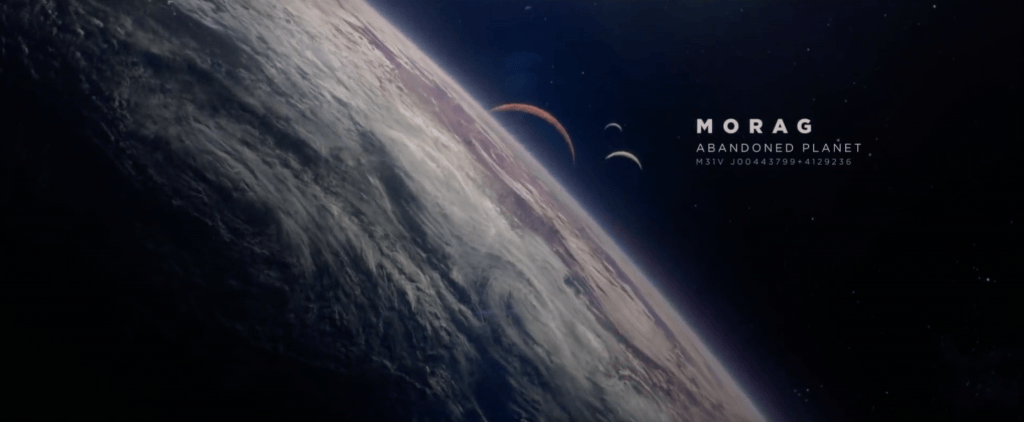
After the first title animation (26 Years Later), the name of the planet is revealed in a similar way – from the first screen grab you can see that the letters are being decoded, however, this time there are multiple lines of information that are also be revealed too. I like the way in which its not all shown at once, it has a staggered effect which not only put emphasis onto the name of the planet but sub-consciously tells the audience what is the most and least important info being shown.

Screen Shot 2017-11-05 at 20.45.13 Screen Shot 2017-11-05 at 20.45.22

The main reason why I like it style of title animation is because of the coded like appearance when it appears on the screen – I feel that this suits the genre of the film really well and also adds to the science fiction element too. Secondly, I also really like the font thats used as it’s really well suited to the genre of the film –  the serif font is very clear and easy to read. Additionally, it also looks very modern as sans serif fonts are more traditionally associated with classic/fancy texts. Thirdly, the hierarchy of the text is also very appealing as it clear and very well structured – the planet name is in bold and is the brightest at the top, this tells the audience that its the most important as it occupies most of the space. The description is second largest in the middle, this again tells the audience about its importance within the whole title and the co-ordinates are smallest and least visible at the bottom. Overall, this a very clear and aesthetically pleasing title animation comprising of several factors which help to communicate it information to the audience, so much so that it was continued on into the sequel, however, its used a different manner and I feel the overall effect of the title convention is less impacting on the audience when compared to the first (which can be seen below).

Overall, I would really like to use this convention within my own animation, however, I would like to adapt and develop upon it so that it more so suited to my theme. I feel like as the film and my animation both fit into the same general category of space that the title element would be very appropriate to use – I would have to think very clearly about the font and also the weight of the text, spacing and alignment as this would have a impact on the viewers experience when watching the animation either consciously or sub-consciously (they might be able to tell if the title element looks odd/out of place). In addition, I feel that the colour and power of the decoding element would have to be thought through clearly as this could also impact the audiences viewing experience.